Lending, made as simple as a
personal-loan app.
Ninja Credit is Ninjacart's own lending platform, giving working-capital loans to small and medium businesses across the country. I owned the end-to-end design strategy — and built a flow so clean it was adopted by other PODs across the company and has disbursed ₹2,800+ Cr since launch.
A loan for your business in just a few clicks.
Not another lending product — a missing experience.
In Q3 2023, Ninjacart decided to digitise a lending business that had run as a pilot for over a year. The pilot was gaining traction, so the company brought every version under one product — and crucially, it had to be open and adaptable, so any team could plug it into their own business module once launched.
Nearly 99% of Ninjacart's loans go to MSMEs — farmers, retailers, importers and exporters — a user base spanning the highly educated to the barely literate. Designing for that range up front set the true scale of the product's potential impact.
The Operational Capital Cycle
On a market visit to Huskur, the team found the primary reason MSMEs seek credit: keeping their operating-capital cycle alive. A business sells its inventory, but payment for those goods arrives a week or two later — a temporal gap. To keep running in between, they take a loan.

Everyone lends. Nobody does it well.
The gap: a clean, trustworthy, genuinely fast digital lending experience — built for businesses, not borrowed from personal finance.
One credit flow, open to the whole org.
Build a single lending flow — as seamless as a personal-loan app — that any Ninjacart POD could adopt and adapt to its own personas and use-cases. The guiding philosophy: break the journey into pieces and optimise each part, end to end.
Get the user, set the limit, hand over the cash.
The journey breaks into three optimised modules — onboarding & underwriting, disbursal, and repayment — each step thought through for speed and clarity.
Getting the user, and setting the limit
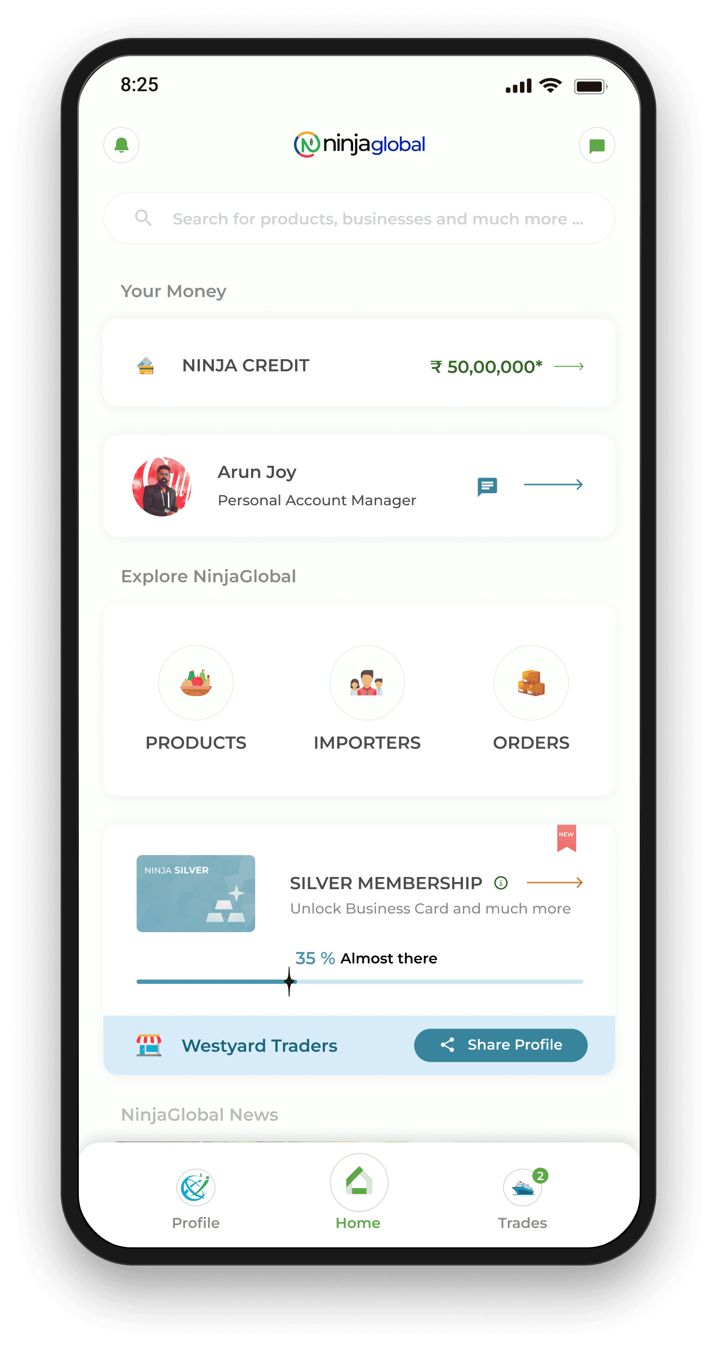
A clean, simple entry point. Credit is a core offering, so it sits straight up on a clean spot — without making the user navigate too much. This same entry was followed across Ninjacart's platforms to surface credit consistently.
A friendly, trustworthy landing. Once onboarding is done, the user lands directly in a section designed to focus only on the important parts — clearing out any cluttered details.
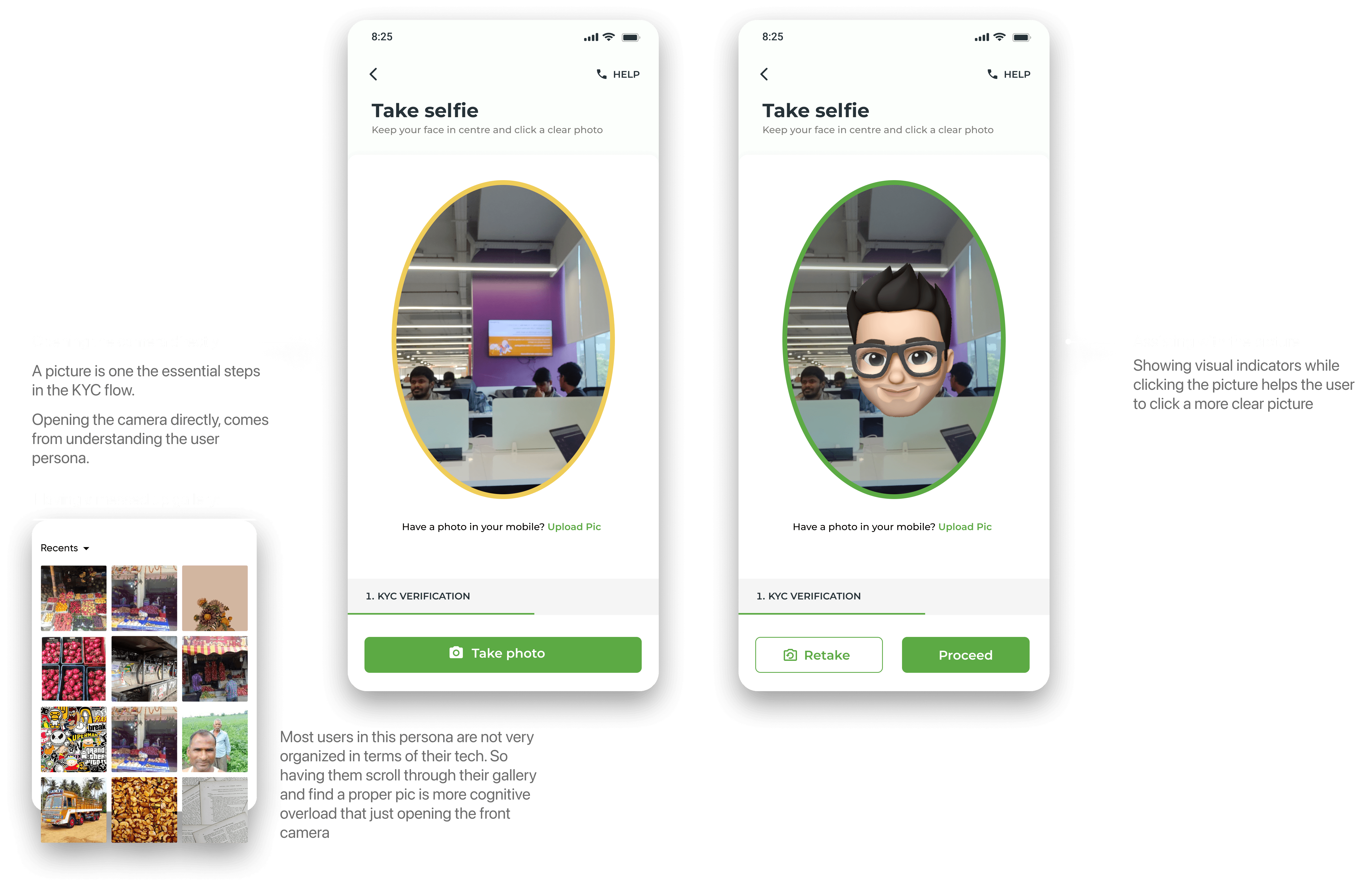
Knowing the user — let's take a selfie. Understanding the applicant's persona drives the flow, so document collection splits in two: Self Upload for users savvy enough to handle the documents and business info themselves, and Assisted Doc Upload — an assisted flow with an agent, powered by The TradeDesk — for the less tech-savvy.
The KYC. One of the most tedious parts of any onboarding — it asks the most input from the user — so it got the most optimisation for speed and clarity.
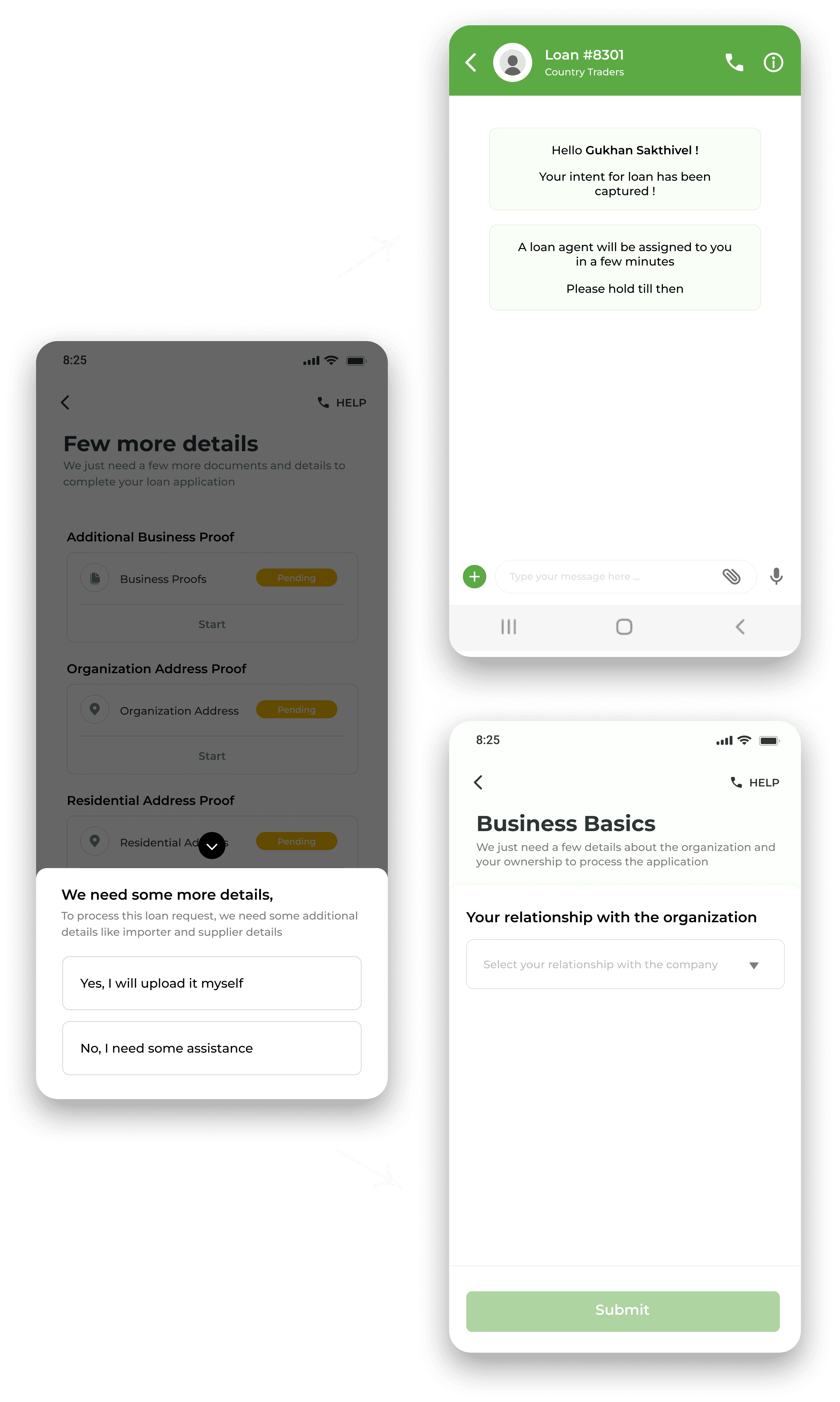
A few more business details. A handful of business documents and details are needed to assess the user's business and arrive at the actual limit and creditworthiness.

Know your potential limit — in a click
A/B testing showed that revealing the final rule-engine limit at the end of onboarding disappointed users: it's usually below the maximum, and the late reveal felt untrustworthy. So we reset expectations at the start — showing a potential limit based on income level. Setting the expectation straight from the start built a sense of trust and transparency from click one.
Sign and take away the cash
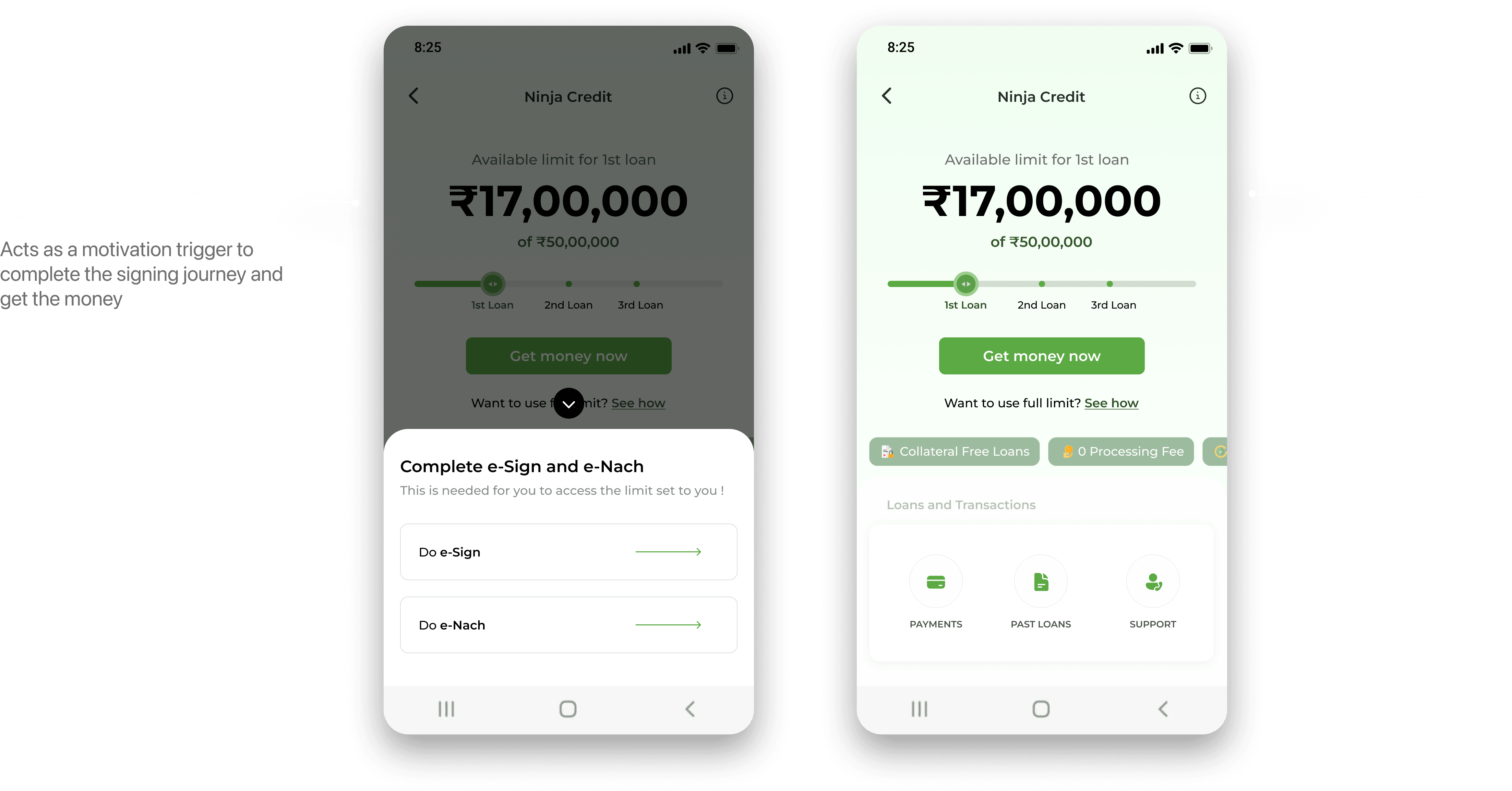
The journey is done and the limit is set — the user can simply sign and take away the money in a few clicks. The whole flow is 4 screens, 6 clicks and disbursed.
Comparing it with the NorthStar principles — the disbursal flow was designed around the primary focus: help the user take a loan as quickly as possible, without having to think too much about the steps. Speed, made the default.
The behaviour that decides a loan's fate
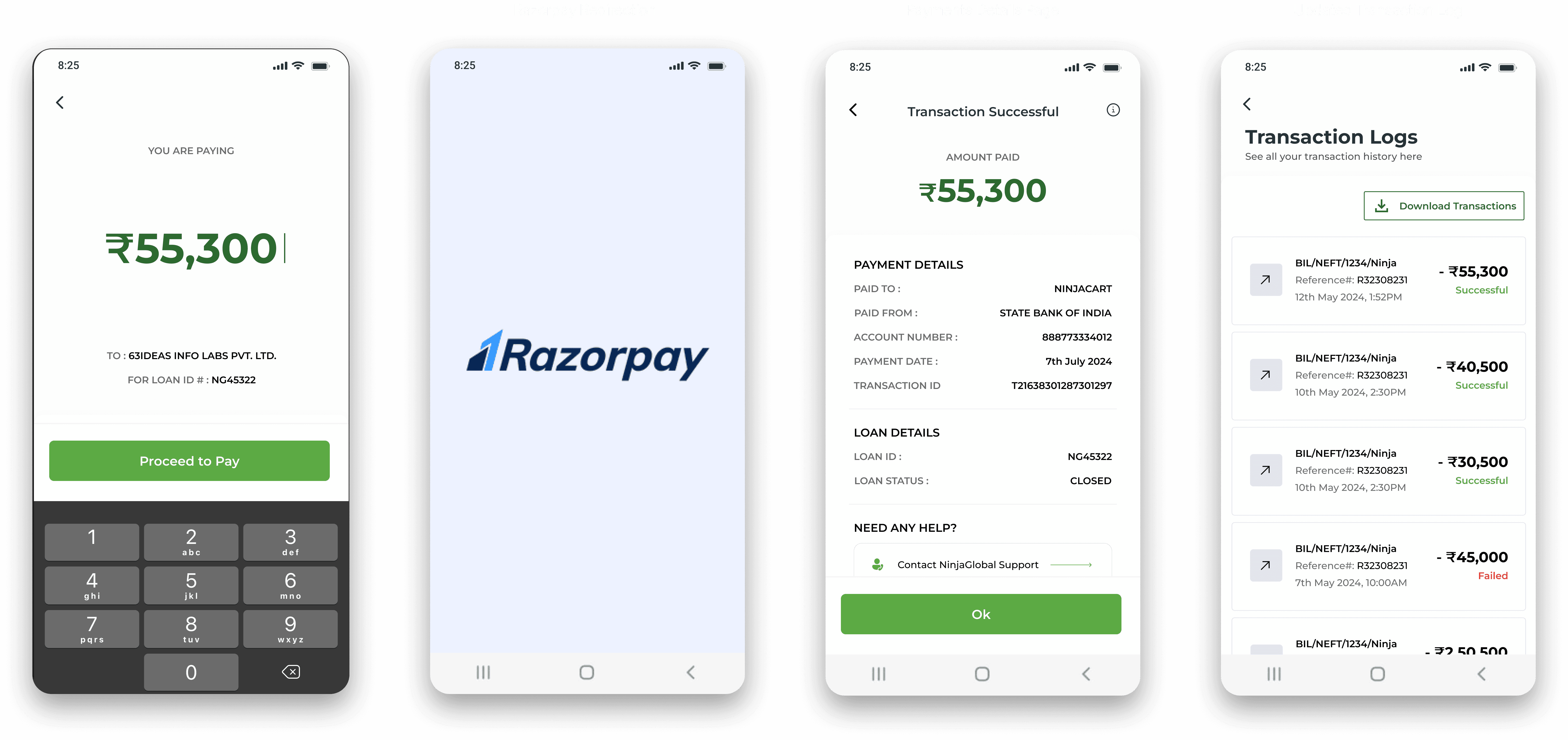
Repayment is the most crucial part of a lending cycle — it's the main behaviour that determines the success of a loan. So it got its own first-class surface.
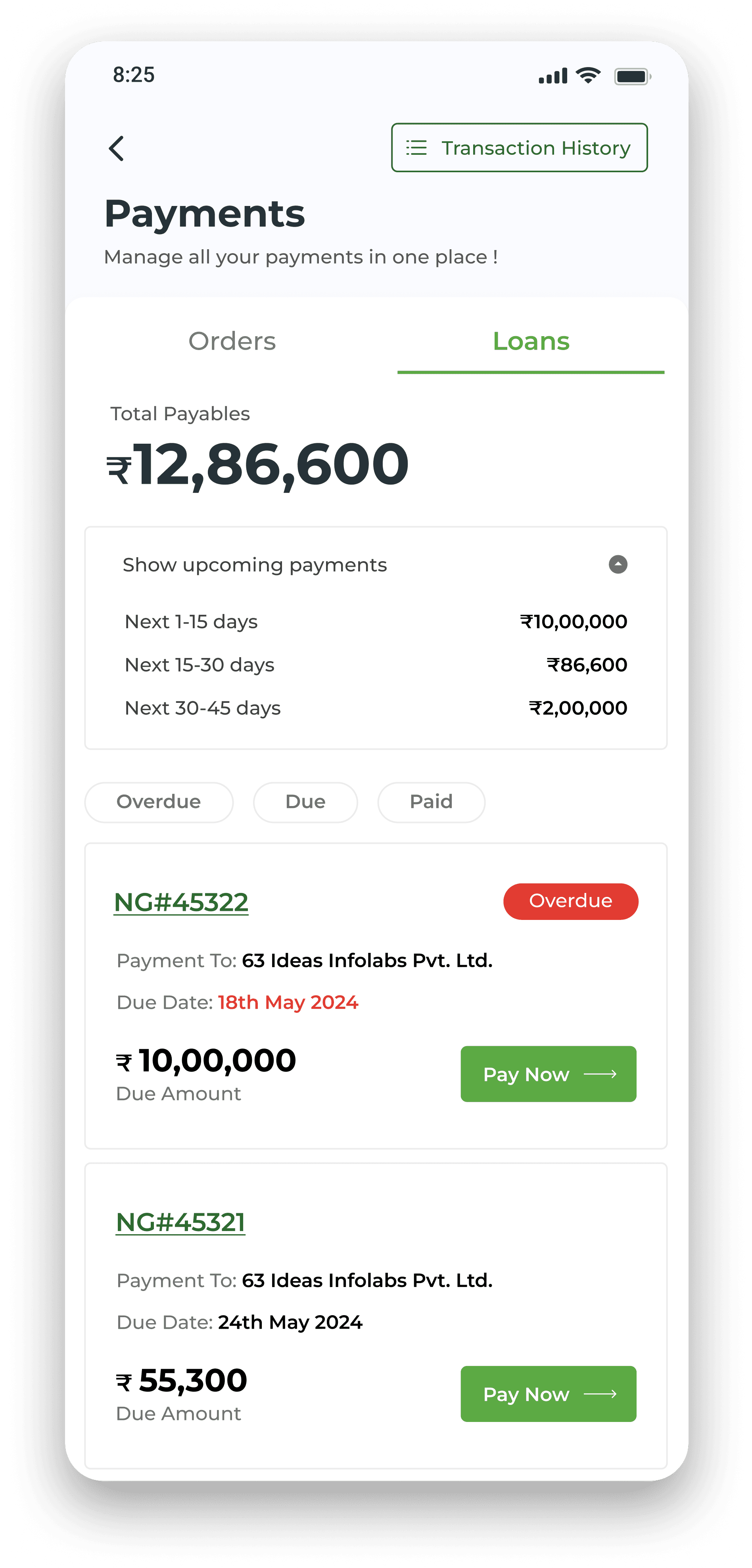
Track and manage all your payments in one place. A user may hold multiple loans at once, each with different due dates and timelines. The Payment Section gives them one page to see all upcoming payments, segmented by filters and dates — an essential tool for staying on top of dues.
Everything payments, in one place. Beyond loans, once a user enters the Ninjacart ecosystem they also have payments, trades and orders — all folded into the section, giving an overall view of everything payments in Ninjacart at one place, with multiple entry points to reach it.
A hit with customers — and reused across the org.
The product became a hit and was welcomed by Ninjacart's customers. As intended, the flow was adopted by other business units and products across Ninjacart — tweaked to each team's design system and use-cases — turning Ninja Credit into the company's reusable credit primitive rather than a one-off product.
The up-front limit reveal built durable trust, and the six-click disbursal made speed the default expectation for lending inside the ecosystem.

I gained a lot.
First-hand experience collaborating with talented PMs, engineers and partners from across the country.
First-hand experience designing for users at scale who aren't tech-savvy — and the discipline that demands.
First-hand experience shipping inside a fintech product, where trust and speed are the whole game.
Personally, deeply satisfying — being the sole designer on a project this impactful was a rare and grounding opportunity.